Rendering performant Sanity.io images
How I've been approaching rendering Sanity images in the web for the past years
Non-web developers are surprised when we tell them how complicated rendering images can be. Worrying about the layout is only a part of it, we also need to ensure images are accessible, performant, and responsive.
Over the years, I've spent hours obsessing over details and often got overwhelmed. Thankfully, Sanity.io's powerful CDN and recent CSS & HTML advancements made it much simpler & easier to get it right. Let's get to it!
The holy grail of web images
In short, we want crisp, fast-loading, accessible images that don't waste bandwidth. Concretely, they need to:
- Scale to their visual placement on the page - no 3000px-wide file in a tiny 50px avatar component
- Scale to the user's device pixel density - a 3x retina screen will use 150 actual pixels to render 50 "virtual" pixels (the equivalent of CSS's
50px) - Be served in the most effective format - if a simple vector, an SVG will always be smaller & crispier, for example
- If cropped by the layout, they should adapt to their container with proper focus on the most important bits of the picture
- Only load when in view (lazy loading)
- Contain clear descriptions in the
altproperty - Avoid low contrast and other visibility issues
MDN's responsive images guide is a great read if you want to diver deeper into the points above. It goes beyond the technicalities of srcsets and brushes on art direction, which is often required for specific types of content.
With Sanity's image CDN we can automate 1, 2 & 3 and give editors the peace of mind of images just working™, so they can focus on creating high-quality content and not on scaling files.
For cropping (#4), you can enable hotspots & crops in Sanity and have your front-end(s) react automagically to them, ensuring the most important bits of the image are always shown, as defined by creators.
6 & 7 are out of the front-end's control, but you can instruct and nudge your editors to help visually impaired readers. See step 3 below.
Now, let's go through the step-by-step to achieve the holy grail above 🌟
Step 1: generating image variations
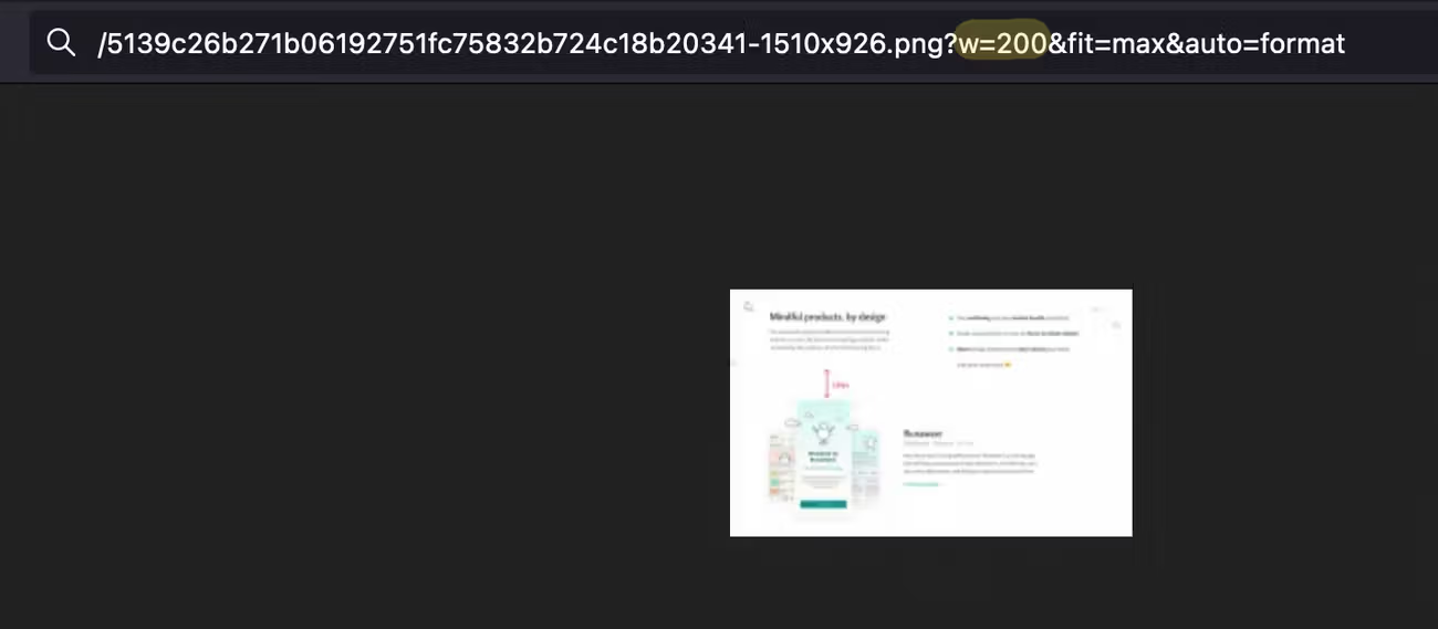
Sanity's CDN allows you to generate multiple variations of the same image by simply replacing a few query parameters in their URLs, such as:
?w=200(scale to 200px wide)?fit=max(scale the image up to its maximum dimensions)?auto=format(use whatever format is more efficient)?bg=333(add a #333 gray color as the image's background, if transparent)?q=40(compress the image to 40% of its original quality)
Refer to the image URL documentation for all the available transformations.
Knowing this, we can build as many size variations of an image as needed for achieving the holy grail described above ✨
We'll generate a set of image sources to feed into the img element's srcset, and specify a sizes property with how the image scales according to the window size, and let the browser pick which image to download based on the user's device width and pixel density. Here's how I generate these variations:
import { getImageDimensions } from "./getImageDimensions";
import imageUrlBuilder from "@sanity/image-url";

export const imageBuilder = imageUrlBuilder({
  projectId: "SANITY_PROJECT_ID",
  dataset: "SANITY_DATASET",
});

const LARGEST_VIEWPORT = 1920; // Retina sizes will take care of 4k (2560px) and other huge screens

const DEFAULT_MIN_STEP = 0.1; // 10%
const DEFAULT_WIDTH_STEPS = [400, 600, 850, 1000, 1150]; // arbitrary
// Based on statcounter's most common screen sizes: https://gs.statcounter.com/screen-resolution-stats
const DEFAULT_FULL_WIDTH_STEPS = [360, 414, 768, 1366, 1536, 1920];

export default function getImageProps({
  /**
   * The image's reference object.
   * Example: {asset: {_ref: string}, hotspot: {...}, crop: {...} }
   */
  image,

  // Number of the largest width it can assume in the design
  // or "100vw" if it occupies the whole width
  maxWidth: userMaxWidth,

  /**
   * The minimal width difference, in PERCENTAGE (decimal), between the image's srcSet variations.
   *
   * -> 0.10 (10%) by default.
   */
  minimumWidthStep = DEFAULT_MIN_STEP,

  // List of width sizes to use in the srcSet (NON-RETINA)
  customWidthSteps,

  // Custom <img> element's `sizes` attribute
  sizes,
}) {
  if (!image?.asset?._ref) {
    return {};
  }
  const maxWidth =
    typeof userMaxWidth === "number" ? userMaxWidth : LARGEST_VIEWPORT;

  // For all image variations, we'll use an auto format and prevent scaling it over its max dimensions
  const builder = imageBuilder.image(image).fit("max").auto("format");

  const imageDimensions = getImageDimensions(image);

  // Width sizes the image could assume
  const baseSizes = [
    maxWidth,
    ...(customWidthSteps ||
      (typeof userMaxWidth === "number"
        ? DEFAULT_WIDTH_STEPS
        : DEFAULT_FULL_WIDTH_STEPS)),
  ];
  const retinaSizes = Array.from(
    // De-duplicate sizes with a Set
    new Set([
      ...baseSizes,
      ...baseSizes.map((size) => size * 2),
      ...baseSizes.map((size) => size * 3),
    ])
  )
    .sort((a, b) => a - b) // Lowest to highest
    .filter(
      (size) =>
        // Exclude sizes 10% or more larger than the image itself. Sizes slightly larger
        // than the image are included to ensure we always get closest to the highest
        // quality for an image. Sanity's CDN won't scale the image above its limits.
        size <= imageDimensions.width * 1.1 &&
        // Exclude those larger than maxWidth's retina (x3)
        size <= maxWidth * 3
    )

    // Exclude those with a value difference to their following size smaller than `minimumWidthStep`
    // This ensures we don't have too many srcSet variations, polluting the HTML
    .filter((size, i, arr) => {
      const nextSize = arr[i + 1];
      if (nextSize) {
        return nextSize / size > minimumWidthStep + 1;
      }

      return true;
    });

  return {
    // Use the original image as the `src` for the <img>
    src: builder.width(maxWidth).url(),

    // Build a `{URL} {SIZE}w, ...` string for the srcset
    srcset: retinaSizes
      .map((size) => `${builder.width(size).url()} ${size}w`)
      .join(", "),
    sizes:
      props.maxWidth === "100vw"
        ? "100vw"
        : sizes || `(max-width: ${maxWidth}px) 100vw, ${maxWidth}px`,

    // Let's also tell the browser what's the size of the image so it can calculate aspect ratios
    width: retinaSizes[0],
    height: retinaSizes[0] / imageDimensions.aspectRatio,
  };
}
If the usage of imageBuilder isn't clear, refer to @sanity/image-url's documentation.
And, to getImageDimensions, we can rely on its image assets' _id (asset._ref):
export function getImageDimensions(image) {
  if (!image?.asset?._ref) {
    return
  }

  const dimensions = image.asset._ref.split('-')[2]
  const [width, height] = dimensions.split('x').map(Number)

  if (!width || !height || Number.isNaN(width) || Number.isNaN(height)) {
    return
  }

  return {
    width,
    height,
    aspectRatio: width / height,
  }
}
Then, we can use getImageProps with any image, according to its maximum size in the layout:
// We call getImageProps with the raw `image` object, not the expanded asset reference.
getImageProps({
  image: {
    _key: "389dd32f5e44",
    _type: "image",
    alt: "A browser window showing another image of this website",
    asset: {
      _ref: "image-556d99f9e1be990a12c0742c62008fe3147f4bad-1430x626-png",
      _type: "reference",
    },
    crop: { /* ... */ },
  },
  maxWidth: 600
});
Initially, I posted this article with a more minimal approach, but I've since extended the function with what I personally use. I plan on abstracting this into a package and simplifying the code above to better explain the approach. In the meantime, reach out if you have questions: meet@hdoro.dev or hdorodev
Step 2: rendering the image
With the srcset, src and size values ready, we can start building the image component itself. I'll use Svelte as it's close to HTML, but you can use these principles with any web framework. Let's start with the basics:
<!-- SanityImage.svelte -->
<script>
	import getImageProps from '../utils/getImageProps';

	export let image;
</script>

<img
  alt={image.alt || " "}
  {// Pass src, srcset and sizes to the image element
    ...getImageProps({
      image,
      maxWidth: 600
    })
  }
/>
With the above, images will load and the browser will choose the proper size for them. BUT all images are loading as soon as the page loads, and what we really want is to only load them when they show up on-screen - the famous lazy loading.
In the past, I'd leverage custom lazy loading code that would hide the image until an IntersectionObserver fired when its parent showed up in the viewport. Then, I'd finally add the <img> element to the DOM and the browser would do its magic.
It worked, but it has a few accessibility and SEO concerns, as the content isn't all there for non-visual readers & bots. Thankfully, in 2022 the loading="lazy" attribute (for images, not iframes) works on all major browsers. So, with one line our images are lazily loaded ✨
<img
  loading="lazy"
  alt={image.alt || " "}
  {// Pass src, srcset, width, height and sizes to the image element
    ...getImageProps({
      image,
      maxWidth: 600
    })
  }
/>
The above won't be 100% smooth for UX, though, as the browser won't know what height the image will assume at a given width. This leads to content jumping around as images load and the browser recalculates their dimensions and the page's layout.
I won't get into any other image styles here - go wild with your designs, it's a simple img element you can plug anywhere! 🔥
In the past, I'd use the padding hack to force a consistent height on the image element (or its parent) and hence prevent content from jumping around. It worked wonderfully but led to extra markup and styles that made it harder to create complex image layouts. Plus, the image component ended up much harder to reason about.
Again, it's 2022 and the browser now calculates the image's aspect ratio based on images width and height attributes (supported across all major browsers). As getImageProps is already returning width & height, all we need to do is set "height: auto" to prevent the image from being distorted! More info on this by Jen Simmons.
<img
  style="height: auto;"
  loading="lazy"
  alt={image.alt || " "}
  {// Pass src, srcset, width, height and sizes to the image element
    ...getImageProps({
      image,
      maxWidth: 600
    })
  }
/>
As an added bonus, our component is now much less tied to framework-specific features. It's literally a couple of generic JS functions and a single <img /> element with dynamic attributes.
React version:
const SanityImage = ({ image }) => {
  return (
    <img
      style={{ height: "auto" }} // could be a global style
      loading="lazy"
      alt={image.alt || " "}
      {// Pass src, srcset, width, height and sizes to the image element
        ...getImageProps({
          image,
          maxWidth: 600
        })
      }
    />
  )
}
Plain JS version:
const SanityImage = ({ image }) => {
  const { src, srcset, sizes, width, height } = getImageProps({
    image,
    maxWidth: 600
  });
  return `
    <img
      style="height: auto"
      loading="lazy"
      alt="${image.alt || " "}"
      src="${src}"
      srcset="${srcset}"
      sizes="${sizes}"
      width="${width}"
      height="${height}"
    />
  `
}
Above-the-fold, "eager" image loading
For images above the fold, such as the one in the "hero" (or header) component, you don't want to lazy load them as you want users to see them as soon as the page is loaded. The image component above could easily support this modification with a configurable loading property:
<!-- SanityImage.svelte -->
<script>
	import getImageProps from '../utils/getImageProps';

	export let image;
	export let loading = "lazy"
</script>

<img
  style="height: auto"
  {loading}
  fetchPriority={loading === "eager" ? "high" : undefined}
  alt={image.alt || " "}
  {// Pass src, srcset and sizes to the image element
    ...getImageProps({
      image,
      maxWidth: 600
    })
  }
/>

<!-- Using the above: -->
<SanityImage image={...} loading="eager" />
Notice we're adding fetchPriority="high" for eager images, which tells the browser to give preference to loading them sooner, reducing the hit on the Largest Contentful Paint performance benchmark.
Bonus: image loading transition/animation
For a nicer loading effect, we can hide the image until it's fully loaded, and then trigger an opacity transition for a subtle-yet-elegant animation. Here's how I achieve that in Svelte:
<script>
  // ...

  let loaded = false
</script>

<img
  ...
  data-loaded={loaded}
  on:load={() => loaded = true}
/>

<style>
  img {
    transition: .15s opacity;
  }
  img[data-loaded="false"] {
    opacity: 0;
  }
</style>
Once loaded, the browser will call the onload event, and the data-loaded attribute will become true, changing the CSS from opacity: 0 to the unset, default value of 1, creating the simple transition.
Step 3: guiding editors & enforcing accessibility
Finally, a crisp, fast-loading, and frugal image component is no good if its output is not shared across all users. To make it more democratic, guide your editors to supplement images with useful alternative descriptions. You can even make the alt fields required if your team is open to it!
// Example image schema in Sanity
export default {
  name: "image",
  title: "Image / photo",
  description:
    "💡 highest quality possible without upscaling the image (up to 2500px). If the image contains text, make sure it's highly readable with a high contrast.",
  type: "image",
  options: { hotspot: true },
  fields: [
    {
      name: "alt",
      title: "Accessibility label for the image",
      description:
        'Help make the site more accessible & SEO-friendly with a short textual description of the image, such as "screenshot of the dashboard app"',
      type: "string",
      validation: Rule => Rule.required(),
      options: {
        isHighlighted: true,
      },
    },
  ],
};
If you want to go the extra (10) mile(s), you could test an image's contrast and how friendly to color-blind people it is. I'm not sure if there's a clear way to run these tests automatically, but given Facebook has been running checks on text in ads' images for almost 10 years, I'm sure we can figure it out. I'd love to help implement something like this, reach out if you're interested: meet@hdoro.dev or hdorodev
That's it! Get in touch if you have questions or suggestions for how to further improve this image component, it'll be a pleasure to connect :)
Changelog
Add width & height attributes
June 29, 2022
Jen Simmons woke me up to a recent browser change that made width & height image attributes useful again. The browser can now calculate the aspect ratio of an image based on its width & height attributes even when the CSS height is set to auto. Watch Jen's talk on it if you want to go deeper.
The support for it is better than the aspect-ratio CSS property, so I've made the switch to that pattern.
To research: do we benefit from adding both aspect-ratio AND width/height attributes? The former has given me a few issues in the past, hence why I chose to remove it, but perhaps there are benefits to keeping it?
Full-size image support
June 29, 2022
getImageProps's maxWidth property can now be "100vw" for images that span the entire screen.
To research: should we support any vw value?
Various fixes & improvements
June 29, 2022
I'm not 100% sure about all these. They make a lot of sense for myself, but perhaps they overcomplicated the function too much.
- Fix sizes sorting. As usual, I forgot Javascript's sort array method doesn't auto-sort numbers. My previous iteration did
sizes.sort(), naively hoping it'd put smaller numbers first. - Remove the default
maxWidthvalue of 1200. That felt arbitrary and confusing. - Defines the minimum step between widths based on percentages, not static values in pixels. This is customizable per-image with
minimumWidthStep - Remove
maxWidth + 20in sizes as that was confusing. - Expose
sizesparameter for customizing<img />'ssizes="..."attribute. - Expose
customWidthStepsfor cases where you may want to customize what base sizes the srcSet is generated from.
I'll eventually move some of these customizations into a package and keep this guide minimal to focus on the ideas behind it.
Configure the image builder without @sanity/client
June 21, 2022
Kitty Giraudel noticed that I was importing the full @sanity/client in front-ends just to configure @sanity/image-url's builder, exposing 67kb of extra javascript to the user's browser.
By configuring imageUrlBuilder with just the projectId and dataset, we remove the need to import the client.
Added section on eager images
June 21, 2022
Thomas Kim pointed me to this image optimization article on Builder.io which refers to the fetchPriority and decoding img attributes. I don't personally think adding a low fetch priority and asynchronous decoding to lazy loaded images makes sense, as we want to load them ASAP once they're onscreen.
BUT this article reminded me I should have a solution for above-the-fold, "eager" images. Hence this new section.
Added a section on loading transition
June 21, 2022
I realized I forgot to add a loading transition for a smoother UX lazy images. Now fixed :)