React for designers
The goal of this guide is to explain, in the simplest and shortest way possible, what is React and what does it implies to you as a UI designer.
What is React
Definition: React is a javascript library (framework) that facilitates the construction of dynamic interfaces and websites. Going deeper into this definition:
- javascript is the programming language native to browsers and the web that brings interactivity and logic to websites and apps. It allows, for example, to get a form's data and send it to a server that will, then, update a users info.
- A library is simply a repository of code (a folder with files) that attend a specific need.
- Interfaces and websites, when built from scratch, can be hard to manage, and you end up writing a lot of otherwise-unnecessary code. React gives you a series of tools that facilitates this process, but there are several others in the market. There are a few reasons why we choose React:
- It was created by Facebook to structure almost all of their products (Instagram, Facebook, WhatsApp...), and, currently, the company pays for a dedicated team to manage and evolve the library;
- It's the most widely adopted web framework. Everyone in the field knows about it, tons of people use it and it has an extremely strong ecosystem around it, providing us with several tools and resources on the matter
- It's relatively easy to learn, as well as very flexible and capable, with nice concepts and abstractions that I love using
React's core principles
The library has three foundational principles: the components, props and state. The whole workflow and mindset of working with React revolves around these concepts, and they're crucial even to visual design, as we'll see ;)
Components
You can think of React as a big Lego box: the idea is that you'll gather each individual piece and combine them to create a final, cohesive product. Each little piece, or component, has a format and a role in the structure in a Lego castle, for example, and each of them can be composed of smaller pieces in their own way. This division serves a great purpose: it allows for effortless reusability, as you can use the same standardized component elsewhere, as many times as needed, such as the duplication of a castle's tower.
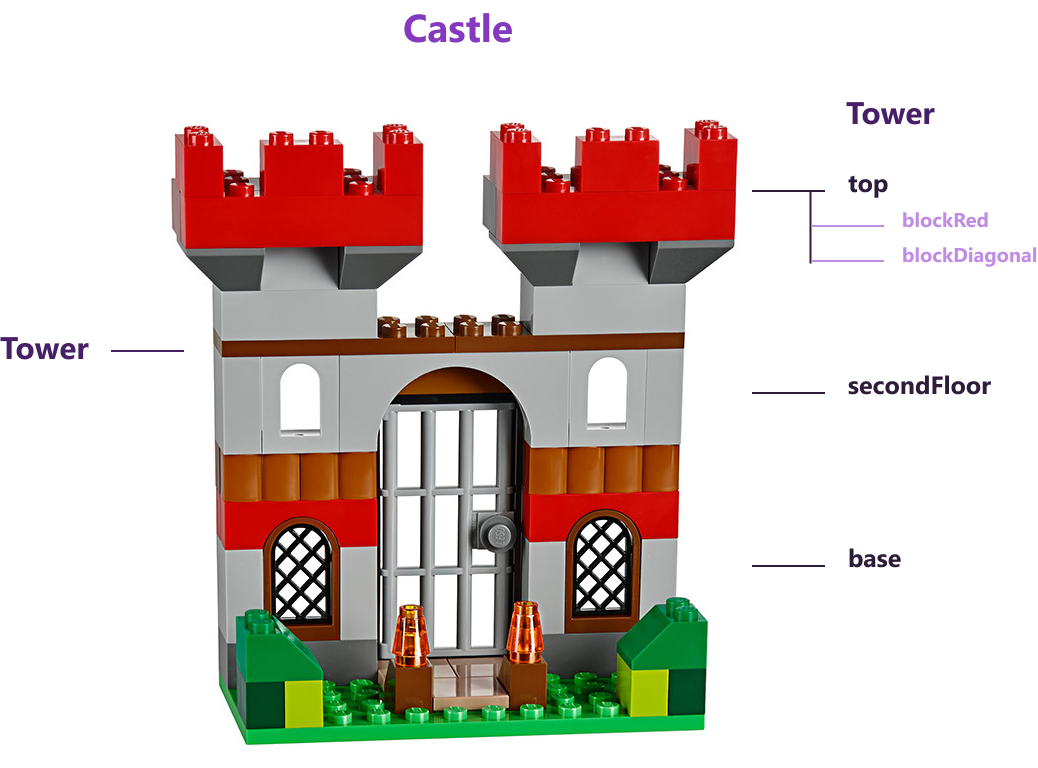
The image above summarizes well this component relationship:
- You have a
castlecomponent that wraps it all; - This
castleis composed, among others, by atowercomponent, that is used twice; - The
towerhas 3 subcomponents:top,secondFloorandbase; - These subcomponents, on their behalf, are also composed by other components. For example,
tophas a few specific block-types, such asblockRedandblockDiagonal.
Props
The componentization workflow helps saving quite a lot work as we don't have to recreate individual pieces every time... but they can only go so far as to duplicate itself, in the same shape and functionality as always, making them not as useful as they could be. Say, for example, that I have a button that, in the design, could be red or green: would I need to create two components buttonRed and buttonGreen? It'd be quite grindy to do so, right? This is where props come in!
Props, as you'd imagine, are properties that you pass to your components for them to alter their shape or functionality accordingly. This allows you to, in the above example, pass a prop color="red" to your button instead of making a whole new component.
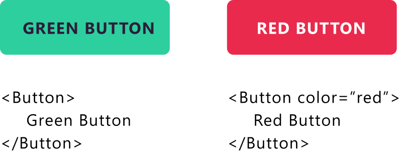
As simple as it its, the above example is a good indicator of the power of components that receive props: they can adapt to different data and become super flexible, turning everything even more modular and reusable! Oh, and it's worth noting that the text between <Button> and </Button> is, itself, a prop. The Button component adapts to this property by using it as the button's internal text 😉
State
If you've already grasped the prop concept, then state will be quite easy: if, on one hand, props come from outside - whatever calls Button defines its text and color, for example - the state is defined inside the component. It's as if the button has a property wasClicked that was internal and controlled solely by the button itself - my button, my rules!
Stateful components can have methods that change or interact with the internal state, and that allows for a series of funcionalities that could range from controlling at which point is a vector in an animation to, for example, if a user is logged in and what is their data in a complex dashboard.
In the above animation (from Novida's website), the FirstSection component has a state shouldStart, that starts as false and, as the site loads, is updated to true, making the background blue (instead of white) and allowing the Tree to show up. This component then has its own state that dictates at which stage the tree currently is, updating it every 150ms or so to the next one in order to simulate a growth animation.
It's worth noting that the props of a component can be defined by the state of a wrapping component (the "parent" component). In the above example, the Tree receives a prop canStart passed down by FirstSection, which controls its value by its own internal state shouldStart. Maybe the code below will make it a bit easier to visualize:
class FirstSection extends React.Component {
    state = {
        shouldStart: false
    }
    render() {
        <Wrapper isBackgroundWhite={this.state.shouldStart}>
        	<Tree canStart={this.state.shouldStart} />
        </Wrapper>
    }
}
As you can see in this simplified example, the FirstSection is a stateful component - which is marked by the class keyword - that holds a shouldStart state and renders a Tree which canStart prop is defined by its parent state. It may sound complicated at first, but you'll get the hang of it!
Following this logic, we get to a very common pattern in React apps: there's a wrapping component that holds the whole project and that contains a huge state, with most of the mutable data of the application. This "root component" then passes down parts of this state to each "child component", as needed. This way, we can distribute a logged-in user's info throughout the header, to show the name and avatar, the user dashboard, and to a input field to leave a message with their name on it, for example.
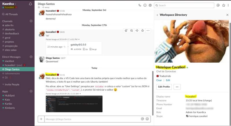
Slack is a good example of this - and is also built in React: the same information - my username and contact info - is stored in the app's root state, in a central directory that distributes this data to the sidebar, the chat and the profile information.
In summary
React advocates for modularity in code, with the creation of reusable components that interact between each other - able to contain and be contained by others. These can pass down props to their child components and/or have internal states, which they can use to search for data, displaying info, reacting to user interaction, controlling animations, etc. React, then, as the library's own name suggests, reacts to changes in state and props and re-renders the interface to the screen. C'est tout!
What does this mean for you as a designer
You don't have to know how React does it, or even what are the possibilities for sites and apps, but you need to understand the component <> props <> state dynamic. It shapes the way we developers think about the structure of the app, the formation of the data (content) and in the variation of different visual components; and, of course, our code revolves around it. And it should shape your design process as well. In the example below, I try to show you why this is relevant.
Practical exemple: testimonial card
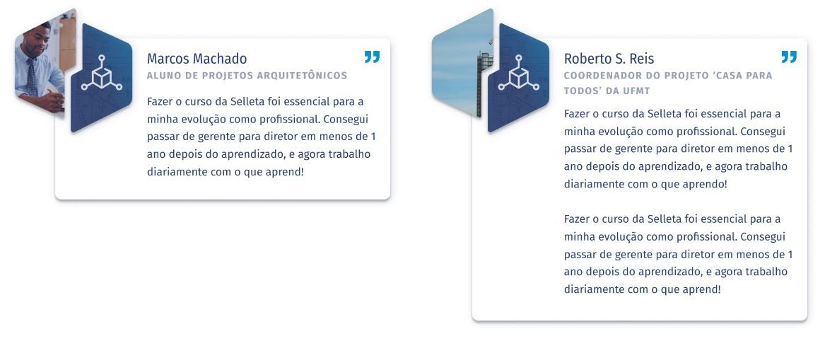
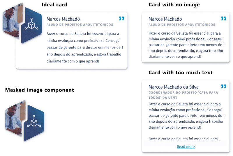
Let's take the testimonial card we created for Selleta's site as an example: the visual design below is what I got from my teammate to develop. As beautiful as it is (great job, Vítor!), it has a few problems, which we'll discuss with the concepts you learned about React.

There are two main things with this design:
- We can't guarantee the quality, orientation or focus of the pictures that will be uploaded about the person, which makes this image mask in the shape of the logo quite fragile: it could be a terrible photo, which focus is outside of the mask, making it impossible for visitors to understand it. So, when using pictures in your design that could be altered by users or clients, work with bad photos and see if they work as well 😉
- A testimonial is already something a bit difficult to obtain and, many times, the info contained in them will be incomplete or in and unexpected format... The props that a
TestimonialCardcould receive, therefore, aren't very predictable:- The person can prohibit the usage of their picture;
- The text body can be HUGE - testimonials with over 2 paragraphs aren't uncommon;
- The icon should say something about the person giving the testimonial, and so we need to spend a good time providing a good selection of options for our client to choose from, else, if we leave it to them, they'll provide icons of various styles, breaking the design language. This means quite a lot of work and time dedicated to such a small task;
- The person's title could be way too lengthy to fit into the card - "Aluno de projetos arquitetônicos" is already quite large, but these particular clients had people with titles such as "Coordenador do projeto 'Casa para todos' da UFMT", which is even bigger 😝
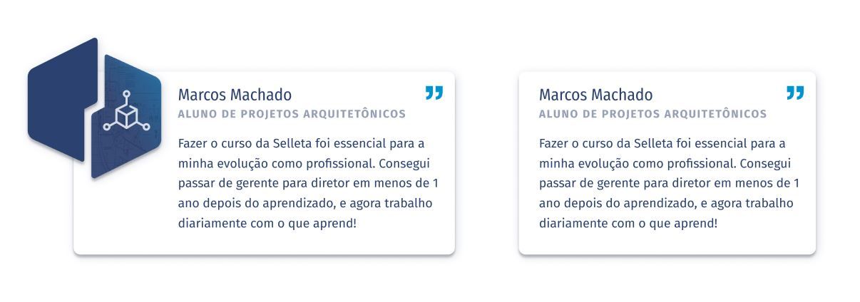
If I were to blindly reproduce this design in code, I could get to the following situation:
The result isn't catastrophic, but the building's image is being cropped at the wrong place, the second card is way bigger than the other and the icon kept the same, making it a bit repetitive... Of course we can limit the number of characters in the content management system (CMS), make a very thorough list of icons for choosing and trying to instruct clients to only upload images with a focus in the middle... but, at the bare minimum, this approach isn't trivial for the developer, who will have to make assumptions. This lack of communication wastes development time and leads to worse results.
And say, for example, that a TestimonialCard didn't get an image prop passed down? Which of the options below the dev should put forward?
Both solutions are easy to implement, the problem isn't code... but they have different implications. When developing, I try to avoid asking "small" questions to the designers in order to avoid wasting their time and to speed up my work, but there are often times I have to revise these tiny decisions later on, wearing me out and slowing the delivery of the project.
So, next time you're creating an interface's wireframe and visual design, think pragmatically about the props that each component needs and start to think about all the possible scenarios. It's going to be a little bit of extra work, but the end result will satisfy you a lot more and your devs will be thankful!
My dream is to find good organization such as the above image in every project 😄