Designing interfaces with development in mind
This guide aims to provide some best practices for designing interfaces with the handoff in mind, having the goal of facilitating the communication between designers and developers. This is an ever evolving guide based on our internal processes at Kaordica, and is by no means final - use it as a basis for your own conventions 😉
TL;DR
- Start your design exploration with no rules to avoid hindering your pace, but start structuring the project before doing real production work and never forget to tidy up your workspace before handing it to development teams;
- Provide and follow a thorough styleguide and design around it;
- Think modularly and componentize your work as much as possible;
- Try to have some minimal foundational knowledge on the tech stack that will be used on the project to guide your decisions - after all, the design must be feasible. If in doubt, reach out to your fellow devs, they'll be glad to help;
- Explore and test every possible usage scenario - or as many as you can - for your interface: users don't always have good pictures to upload, and might not fill every info field, for example... how will the product react to that?
- When still images don't cut it in explaining desired behaviors, use transitions. If they aren't enough, write down the explanation and be ready to answer questions;
- Name things properly;
- Be open to feedback from devs and learn from it.
It's a ton of things to remember at once, but they'll fit naturally into your workflow and actually make the design process much more rewarding and the development phase quicker - at least it did for me.
Starting the design
This section is nothing more than you're already used to: when starting the project, provided you already have a direction for the work, begin by letting go of any rules and expectations you might have and just start exploring what you could do. This applies to both the wireframe (the disposition and functionality of things) as well as the visual design (how things look and feel), and should happen without any decision - subconscious or not - being made.
At Kaordica, we create the wireframe carefully together with the clients during a design sprint workshop, as we believe it's the most important part of the design: it's where we think more about UX than making things pretty, allowing for alignment of the product vision with the client. Then, with most oft he flow and copy in place, we gather the (desired) attributes of the brand and relevant references - many of which suggested by clients - and start exploring colors, font faces, and everything else concerning the visual design.

Then, when we start seeing something that can be put forward, we usually create a couple "stylegrams" - a montage with a consistent visual language - and share them with clients to choose. This prevents any surprises down the line and keep us all in the same boat - oh, and clients are also big fans of regular-but-not-too-much updates. If you're on a tight schedule, I'd still say it's worth it 😉

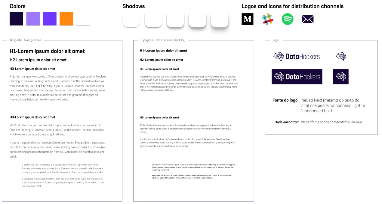
Finally, with these things in place, it's time to start structuring our project for the actual production work to avoid messy documents delivered to developers later on without unnecessary rework. And let me tell you, as a developer myself: if you don't standardize typography, colors, shadows and the like, devs will. Code gets unmanageable if we use distinct variables for each and every different implementation you have, so try to, whenever possible, follow a styleguide - besides a happy developer, you'll also have a more consistent design that users will love!
Following a styleguide
If I've convinced you of the importance of properly following a structure on your projects, then you must first understand what I mean by a styleguide. Also known as a "pattern library", this thing is an area of study in and of itself, and for such I won't go deep into it: just know that it can come in all shapes and sizes and has to do with standardizing the building blocks of your brand's user interfaces. With this terribly broad description I can even fit my personal version of it: a style sheet containing every typographic variation, color schemes, box-shadows, grids and logos.
A styleguide can contain a brand's voice and tone, patterns for content creators, standardized components to use, margins, icons, filters, etc., and you're right in saying my... sorry effort is none of that, but that's beside the point. Call it whatever you want, that's beside the point, the fact is that the above organization is perfect for what I needed for the project - a "simple" website - and really helped me out during development.
So, before going any further in the work, gather what you got in the exploration phase and prepare your own simple stylesheet, containing whatever you know you'll use in the project. Nothing has to be carved in stone, these things may change over the design process and you can add new ones as needed, but doing so at the beginning will force you to be more organized and test more often with different values, as tools like Figma, XD and the likes broadcast updates through the whole design. Feel a color isn't quite there? Just tweak it and see the real results, in real time, till you're satisfied. I grant you this is better than trying to standardize everything at the end for the handoff deadline.
Embrace the modularity - not singularity
Now, speaking of saving time later in the project, you should really start thinking in reusable components, else you'll find yourself cursing when having to fix a margin on a header present in 10 pages - or worse, who knows. I talk a bit more about this philosophy in my React for designers article, and I'm sure you've heard this quite often, so I won't go into much detail here.
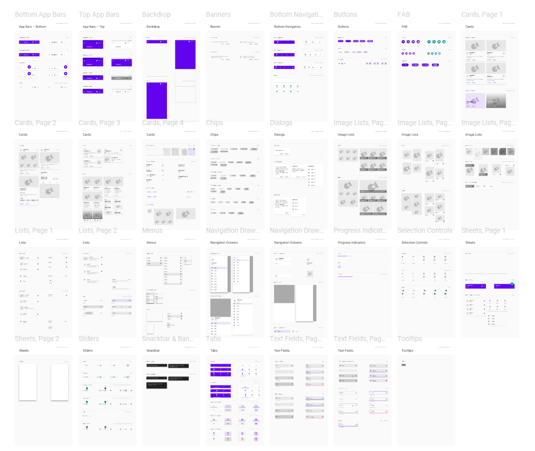
Just know that, as much as creating and naming components in your UI design tool can be a hassle at first, it pays off. It sends a clear message to devs about what you were thinking in terms of organization and reusability when you built each thing and helps you test and spread changes throughout the design much easier. Also, it tends to force you to think about the possible scenarios of usage for each of them, preventing impossible or incoherent designs...
Oh, and for often reused pieces, a component will actually speed up your time quite a lot, just look at UI libraries for design tools like Figma's Material Design Theme Kit - they wouldn't sell so much if it wasn't easy, right?
Know the waters you surf in
Besides the reality check brought by the modularity mindset, that drives you into thinking about which properties each component should get - and the availability of each of those -, which can help steer a decision, knowing a little bit about the platform in which the design will be brought to life is a great plus.
Say you're creating a dashboard that will later be a web app... A decent knowledge on HTML and CSS would allow you to see that the following design, seemingly simple, is possible, but hard to pull off and might become quite brittle in some browsers:
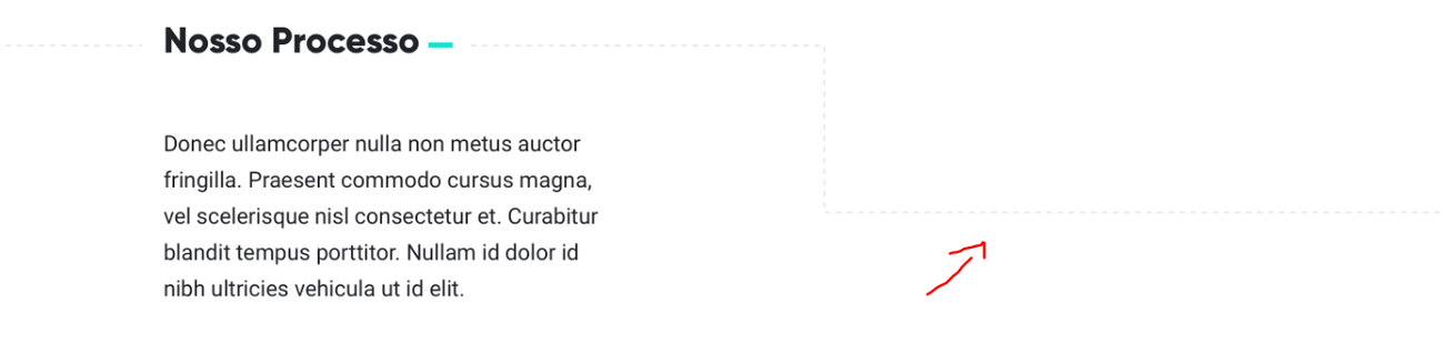
The title and body are super straightforward, the problem is the grey dotted line... It's almost invisible in the white background and, though making the layout a bit more interesting, it's a pain to reproduce. Using an image or SVG (a vector file) is possible, but you'd have some problems with screen resize, probably forcing the creation of several different versions; using only HTML elements and CSS is also possible, but would pollute the markup and create the need for several new lines of otherwise useless code.
Other fellow developers might disagree with me in this, but I'd rather not do it: it's an increased overhead in terms of maintenance, page size and mobile performance for a tiny visual gain. By arming yourself with knowledge about the platform, which could be as easy as ~10h of HTML and CSS courses and practices, this type of thing will happen with much less frequency, guarantee. You'll be happier to see your design fully fledged without alterations and devs will be happy for... well, working less 😉
Of course, you won't be able to think about every possible scenario - even myself as a front-end developer don't really know if many designs are feasible until I try it, but having this in mind will, over time, create this comprehension, promise!
Let go of your beautiful, controlled environment
Yes, I know you want to impress clients and give a tap in your back for creating such a gorgeous visual design, but I have to warn you: that professional photography and short description won't be there in real users' profiles. I'm not saying to show ugly stuff to clients or to put away all the nice screens you have, these are great to show what you're capable of in terms of composition.
The thing is, when relying solely on these, you'll end up with really ugly real world results. Trust me, I've learned this in practice, here's what my beautiful design became:
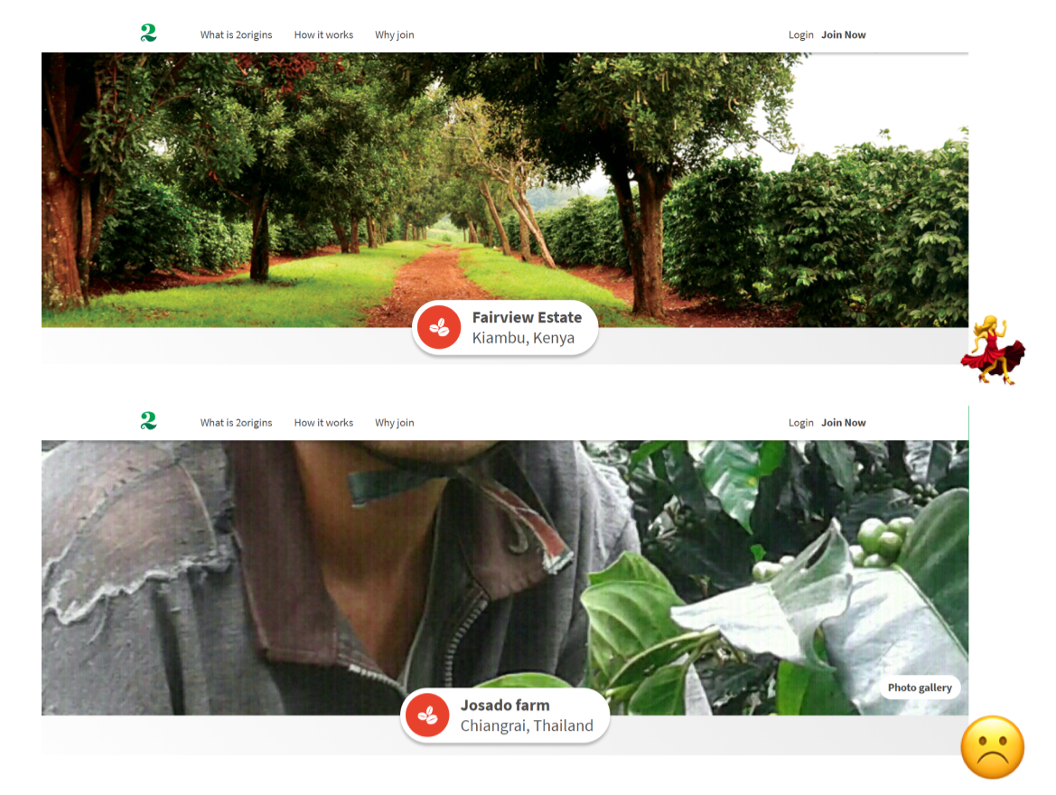
So, when analyzing a wireframe and thinking about the upcoming visual design, be sure to plan what properties are mutable by users (or clients), how they could go missing or how they could be horribly formatted. This might give you a clue as to how to deal with scenarios such as the one above and prevent your devs from having to figure it out on their own. The result will be better and less time and energy will be spent in development 😉
Guide devs through the design
Don't just send a link or PDF and think you're done with it.
Spend some good minutes going through the design with developers in a videoconference, record a video, use transitions and share prototypes for clearer representations of what has to be done, write about what can't be easily explained through still images. Do what you can to make them understand your vision, and be there to help them when that doesn't happen. Be creative.
Point dismissed, next!
Name things properly
I'll can write more on the subject, but, in short, names don't have to be short, they have to be self explanatory! CardOne is so much worse than WhiteRoundedCard when you're passing your work forward - be it to others or to yourself in 3 months - that the hassle of the extra characters is justified.
Visual design doesn't suffer from this need as much as code, as, when you doubt, you can simply take a look at what awesome-tab-1 is, but acquiring good naming habits will surely help your organization... Plus, if regularly working with the same development teams, you can share naming conventions and talk about each component specifically whenever needed:
Hey, the secondary button has the wrong padding in the website.
Oh, that was intentional! I figured it was too far from the rest of the site, should I change it?
With good naming conventions, it'll all be birds, flowers and rainbows 🤗
The old "open to criticism thing"
Well, after all of these points, it should be clear that there's a ton of stuff that can be improved in your workflow when it comes to handing UIs to developers, and this list isn't exhaustive... So, you know, if all we know is nothing, we gotta listen to others.
I try to be both a designer (though more focused on UX, I suck at visual design) and a developer, and this puts me in a place to easily find ways to improve our processes here at Kaordica, but this can only go so far. I've never worked in another design team and my tech stack has been only in the web space since I began coding, and, of course, there's always the blindness to our own mistakes... So do everybody a favor and contribute to this guide with all your experience and knowledge you've accumulated through open listening 😄
Every constructive feedback is welcome, but please keep the hatred away, s'il vous plaît.